
Financial Econometrics: Part 08
Welcome to the next article in our Financial Econometrics series!
In our journey so far, we’ve used WLS to tame unequal variance (heteroscedasticity), Robust Regression (RLM) to defend against outliers and Lasso to manage the “curse of dimensionality” and prevent overfitting.
Through all of this, we have “armored” our model. But all these methods, from OLS to Lasso, are still linear models at their core. They all share one fundamental, and sometimes fatal, assumption: that the relationship between our independent variables ($X$) and our dependent variable ($Y$) is a straight line (or a flat plane).
What happens when this assumption is wrong? What if the relationship between, say, 10-year Treasury yields and the U.S. Dollar Index isn’t a simple line, but a complex curve?
All our previous models would fail. They would try to force a straight line onto a curved pattern, resulting in a model with high bias; a model that is fundamentally wrong and “underfits” the data.
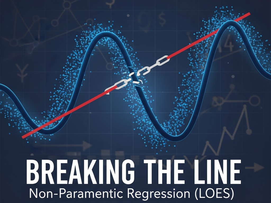
In this article, we’ll break free of that “linear” constraint. We’ll explore the world of Non-Parametric Regression, a method that “lets the data speak for itself” by making no prior assumptions about the shape of the relationship. We’ll focus on a powerful and intuitive method: LOESS (locally estimated scatterplot smoothing).
Parametric vs. Non-Parametric: What’s the Difference?
This is the most important concept to grasp.
- Parametric Regression (e.g., OLS, Ridge, Lasso):
- We assume a specific functional form. For OLS, we assume: $Y = beta_0 + beta_1 X_1 + … + e$.
- The only job of the model is to find the best values for the “parameters” ($beta_0, beta_1, …$).
- Pros: Fast, easy to interpret (a one-unit increase in $X_1$ leads to a $beta_1$ change in $Y$), and works well with few data points.
- Cons: High bias. If the true relationship isn’t a line, the model is wrong before it even starts.
- Non-Parametric Regression (e.g., LOESS):
- We do not assume any functional form. We just assume the relationship is “smooth.”
- The job of the model is to find a function $f(X)$ that fits the data as flexibly as possible.
- Pros: Very flexible, low bias. Can capture complex, curved patterns.
- Cons: “Data-hungry” (needs more data), computationally slower, and harder to interpret (there’s no simple $beta_1$ coefficient to read).
The LOESS Algorithm: “Think Local, Not Global”
So, how do we build a flexible curve without assuming its shape? The brilliant idea behind LOESS (or LOWESS for Locally Weighted Scatterplot Smoothing) is to stop thinking globally and start thinking locally.
Instead of trying to fit one “best-fit” line to all the data, LOESS fits many tiny, “best-fit” lines, one neighborhood at a time.
Let’s see the step-by-step logic. Here’s how LOESS builds its curve at a single focal point, $x_0$:
- Pick a Focal Point ($x_0$): This is the specific point on the x-axis where we want to make a prediction, $hat{y}_0$.
- Define a “Neighborhood”: We choose a “span,” (called frac in statsmodels), which is the fraction of data points nearest to our focal point. For example, a frac of 0.3 means “find the 30% of data points that are closest to $x_0$.”
- Assign “Kernel” Weights: We give weights to all the points inside this neighborhood. This is the “Locally Weighted” part.
- Points very close to $x_0$ get a high weight.
- Points at the edge of the neighborhood get a low weight.
- The most common weighting scheme is the Tricube function, which looks complex but is very intuitive: $W(u) = (1 – |u|^3)^3$, where $u$ is a point’s distance from the focal point, scaled from 0 (at the center) to 1 (at the edge).
- Crucially, all points outside the neighborhood get a weight of zero.
- Run a “Local” WLS: We fit a Weighted Least Squares (WLS) regression using only the points in the neighborhood and the kernel weights we just calculated.
- Get the Prediction: The prediction $hat{y}_0$ is simply the fitted value from this local WLS, evaluated right at the focal point $x_0$.
- Repeat for All Points: To draw the entire smooth curve, we repeat this whole 5-step process for every single data point in our dataset, making each one the “focal point” in turn.
The result is a smooth, flexible curve that follows the “center of gravity” of the data, bending and turning where the data bends and turns.
The “Tuning Knob”: The Span (frac)
This method is powerful, but it has a “tuning knob” just like Lasso did. Here, it’s the span (frac). This knob controls the Bias-Variance Tradeoff for our LOESS model.
- Small frac (e.g., 0.1): The neighborhood is tiny. The model is extremely flexible and “wiggly,” as it’s fitting many tiny, independent lines. This leads to low bias (it follows the data) but high variance (it’s overfitting to the local noise).
- Large frac (e.g., 0.9): The neighborhood is huge. The model becomes very “stiff” and smooth. As frac approaches 1.0, the “local” model becomes the “global” OLS model. This leads to low variance but high bias (it will underfit and smooth over real curves).
We must find the “Goldilocks” frac that is smooth enough to ignore noise but flexible enough to capture the true pattern. This is often done visually or using a cross-validation method like Leave-One-Out Cross-Validation (LOOCV).
Practical Application: X10Y_TBY vs. DXY
LOESS works best in low dimensions (1 or 2 predictors), where it’s a powerful visualization tool. Let’s use it to examine the relationship between our 10-year Treasury yield (X10Y_TBY) and the Dollar Index (DXY).
We’ll fit three models:
- Global OLS: Our old “straight line” model (high bias).
- LOESS (Overfit): A model with a tiny frac (high variance).
- LOESS (Good Fit): A model with a well-chosen frac.
The Python Code Walkthrough
We will use statsmodels for this, as it has an excellent lowess implementation.
import pandas as pd
import numpy as np
import statsmodels.api as sm
import matplotlib.pyplot as plt # We'll need this to visualize

# 1. LOAD AND PREPARE THE DATA

print("--- 1. Loading Data ---")
data = pd.read_csv('M2_data.csv')
data['Date'] = pd.to_datetime(data['Date'])
data = data.set_index('Date')

# For this example, we'll model DXY with only X10Y_TBY
dependent_var = 'DXY'
independent_var = 'X10Y_TBY'

data_clean = data[[dependent_var, independent_var]].dropna()

Y = data_clean[dependent_var]
X = data_clean[independent_var]

print(f"Data loaded. Modeling {dependent_var} ~ {independent_var}")
print("-" * 30 + "\n")


# 2. RUN A "BASELINE" OLS MODEL

print("--- 2. Running OLS (Global) Model ---")
X_ols = sm.add_constant(X)
ols_model = sm.OLS(Y, X_ols)
ols_results = ols_model.fit()

# Get the fitted values
ols_preds = ols_results.predict(X_ols)
print("OLS model fit.")
print("-" * 30 + "\n")


# 3. RUN LOESS MODELS

print("--- 3. Running Non-Parametric LOESS Models ---")

# statsmodels.nonparametric.lowess returns an array of
# [x_sorted, y_fitted]
# We must sort our data by X for plotting

# First, sort the data
data_sorted = data_clean.sort_values(by=independent_var)
Y_sorted = data_sorted[dependent_var]
X_sorted = data_sorted[independent_var]


# --- Model 1: LOESS (Good Fit) ---
# Let's use a "span" (frac) of 0.3, or 30% of the data
# This is a good starting point
loess_good_fit = sm.nonparametric.lowess(
    Y_sorted, X_sorted, frac=0.3
)
loess_good_Y = loess_good_fit[:, 1] # Get just the Y-fitted values


# --- Model 2: LOESS (Overfit / "Wiggly") ---
# Let's use a tiny "span" (frac) of 0.05, or 5%
loess_overfit = sm.nonparametric.lowess(
    Y_sorted, X_sorted, frac=0.05
)
loess_overfit_Y = loess_overfit[:, 1] # Get just the Y-fitted values

print("LOESS models fit.")
print("-" * 30 + "\n")


# 4. VISUALIZE THE RESULTS
# (Note: In a real application, you would use 'plt.show()')

print("--- 4. Visualizing the Fits ---")
print("Generating plot of OLS vs. LOESS...")

plt.figure(figsize=(14, 8))

# a. The raw data
plt.scatter(X, Y, alpha=0.3, label='Data')

# b. The "bad" OLS line
# (We need to plot it against the sorted X values for a clean line)
ols_preds_sorted = ols_results.predict(sm.add_constant(X_sorted))
plt.plot(X_sorted, ols_preds_sorted, color='red', linewidth=3,
         label='OLS (Global, High-Bias) Fit')

# c. The "too wiggly" LOESS
plt.plot(X_sorted, loess_overfit_Y, color='orange', linewidth=2,
         linestyle='--', label='LOESS (frac=0.05, High-Variance)')

# d. The "just right" LOESS
plt.plot(X_sorted, loess_good_Y, color='green', linewidth=3,
         label='LOESS (frac=0.3, Good-Fit)')

plt.title('Parametric (OLS) vs. Non-Parametric (LOESS)', fontsize=16)
plt.xlabel(independent_var, fontsize=12)
plt.ylabel(dependent_var, fontsize=12)
plt.legend(fontsize=12)
plt.grid(True, alpha=0.5)

# Save the plot to a file
plt.savefig('loess_comparison_plot.png')
print("\nPlot saved as 'loess_comparison_plot.png'.")
print("This plot shows the 'high-bias' OLS line,")
print("the 'high-variance' wiggly LOESS,")
print("and the 'good-fit' LOESS curve.")
print("\n\n--- End of Analysis ---")
Interpreting the Results

- The Scatter Plot (Blue): The raw DXY vs. X10Y_TBY data. We see a “cloud” of points that isn’t perfectly linear.
- The OLS Line (Red): A single, straight line that cuts through the data. It’s clear that this line is “missing” the local patterns and is a poor fit (high bias).
- The “Wiggly” LOESS (Orange): This line, with frac=0.05, is “spiky” and “jumpy.” It’s trying to follow every little random pocket of data. This is a classic sign of overfitting (high variance).
- The “Good” LOESS (Green): This line, with frac=0.3, is a smooth, gentle curve. It captures the main, non-linear trend of the data while “smoothing over” the random noise. This is the “just right” model, balanced in its bias-variance tradeoff.
This visual tells us, in a way no p-value could, that the relationship between these two variables is not linear. A simple OLS model would have been wrong.
Our Journey: A Complete Toolkit
Let’s take a look at the “monsters” we’ve defeated in our series of articles:
- Problem: Our model’s errors were unreliable (p-values were wrong).
- Monster: Heteroscedasticity (unequal variance).
- Solution: WLS
- Problem: Our model’s coefficients were corrupt (pulled by bad data).
- Monster: Outliers.
- Solution: Robust Regression (RLM)
- Problem: Our model was too complex and “memorized” noise (it couldn’t predict).
- Monster: Overfitting / Curse of Dimensionality.
- Solution: Lasso Regression
- Problem: Our model’s fundamental assumption was wrong (the world isn’t a straight line).
- Monster: Linearity (high bias).
- Solution: Non-Parametric (LOESS)
The key takeaway is that there is no “one best model.” OLS is a starting point, not a destination. A true data scientist or econometrician doesn’t just know how to run a model; they know when a model is failing and have a complete toolkit to diagnose and fix it.
You now have that toolkit. You’ve learned how to build models that are not just fit, but robust, parsimonious, and flexible.
Our next step would be to look at variable distributions, but for regression, our journey is complete. Well done.