
Financial Econometrics: Part 12
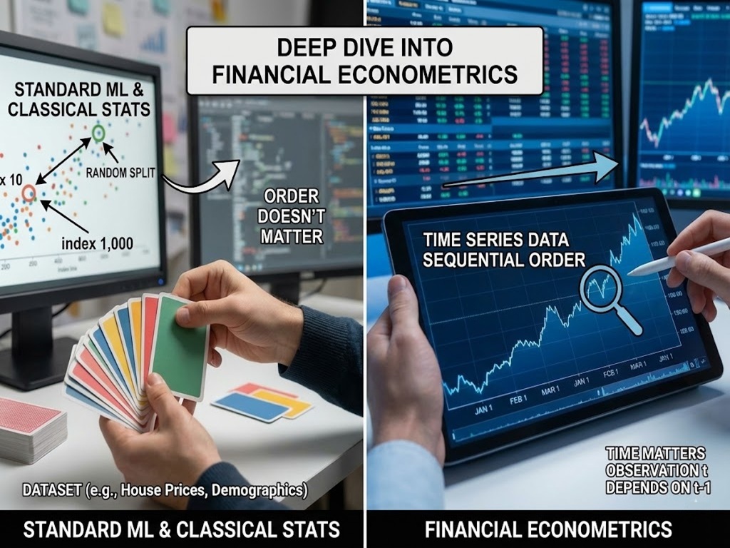
Welcome to our deep dive into Financial Econometrics. If you are coming from a background in standard machine learning or classical statistics, you are likely used to a specific way of treating data. You take a dataset, maybe a list of house prices or customer demographics, and you shuffle it. You split it into training and testing sets randomly. In that world, the observation at Index 10 is just as relevant as the observation at Index 1,000. Order doesn’t matter.
In Time Series Analysis, shuffling the data is a crime.
Time is the fourth dimension of our data. It adds a constraint and a structure that provides unique insights but also unique challenges. A time series is not just a list of numbers; it is a history. The price of Google stock today is not an independent random event; it is heavily influenced by what the price was yesterday, last week, and last month.
In this article, we will unpack the vocabulary of time series, understand the “heartbeat” of data through correlation, and tackle the most critical concept in the field: Stationarity.
Part 1: The Linguist’s Toolkit (Mathematical Operators)
Before we build models, we must agree on a language. Time series analysis relies on a few specific operators that allow us to manipulate time mathematically.
1. The Time Machine: The Lag Operator (L)
Imagine a function that can step back in time. In econometrics, we call this the Lag Operator, denoted by L (or sometimes B for Backshift).
If we have a time series \(Y_t\) (where t is today), applying the lag operator gives us the value from yesterday:
\(L Y_t = Y_{t-1}\)
If we apply it twice (\(L^2\)), we go back to the day before yesterday:
$$L^2 Y_t = Y_{t-2}$$
Why do we care? Because in finance, “yesterday” is often the best predictor of “today.” If you want to predict tomorrow’s temperature, the single best guess is usually today’s temperature.
2. The Agent of Change: The Difference Operator ($Delta$)
Financial analysts rarely care about the absolute level of an index. We care about change. The difference operator (\(\Delta\)) tells us how much the series has moved since the last period.
$$\Delta Y_t = Y_t – Y_{t-1}$$
Notice that we can rewrite this using the Lag operator:
$$\Delta Y_t = Y_t – L Y_t = (1 – L)Y_t$$
3. Log Returns: The Financial Favorite
You will rarely see raw prices modeled in professional quantitative finance. Instead, we use Log Returns.
If \(P_t\) is the price of an asset at time t, the simple return is \(\frac{P_t – P_{t-1}}{P_{t-1}}\). However, simple returns have a mathematical flaw: they are not symmetric (a 50% loss requires a 100% gain to recover).
Log returns solve this. They are calculated as:
$$r_t = ln(P_t) – ln(P_{t-1}) = ln\left(\frac{P_t}{P_{t-1}}\right)$$
Tip: Log returns are preferred because they are time-additive. The log return of a year is exactly the sum of the log returns of the days within that year. This makes the math in complex models significantly cleaner.
Part 2: The Echo Chamber (Autocorrelation)
If you shout into a canyon, you hear an echo. The sound you hear is a delayed version of the sound you made. Time series data has a similar property called Autocorrelation.
In standard statistics, we calculate the correlation between two different variables (e.g., Height vs. Weight). In time series, we calculate the correlation of a variable with itself at different times.
The Autocorrelation Function (ACF)
The ACF measures the linear relationship between \(Y_t\) and its past values \(Y_{t-k}\) (where k is the lag).
- Lag 1 ACF: Correlation between Today and Yesterday.
- Lag 12 ACF: Correlation between This Month and the same month Last Year (crucial for seasonal businesses like retail).
$$\rho_k = \frac{\text{Cov}(Y_t, Y_{t-k})}{\sqrt{\text{Var}(Y_t)\text{Var}(Y_{t-k})}}$$
Intuition: Think of ACF as the “total memory” of the series. If a stock market crash happens today, the ACF tells us how long the “shockwaves” of that event will continue to ripple through the data into the future.
The Direct Line: Partial Autocorrelation (PACF)
This is where students often get confused.
- ACF includes direct and indirect effects.
- PACF captures only the direct effect.
The “Connecting Flight” Analogy: Imagine you fly from New York (\(Y_{t-2}\)) to London (\(Y_{t-1}\)), and then from London to Paris (\(Y_t\)).
- ACF: If we look at the ACF between New York and Paris, it will likely be high. Why? Because you were in New York, which led you to London, which led you to Paris. There is a correlation.
- PACF: The Partial Autocorrelation asks: “Did New York directly influence Paris?” No. Once we account for the fact that you were in London, the New York leg becomes irrelevant to your arrival in Paris. The PACF between New York and Paris would be near zero.
In modeling, ACF helps us see trends, while PACF helps us identify the true structural drivers of the series.
Part 3: The Golden Rule – Stationarity
If there is one concept you must memorize from this article, it is Stationarity.
Most statistical forecasting methods assume that “history repeats itself.” But for history to repeat itself, the “rules of the game” must remain constant.
Strict vs. Weak Stationarity
- Strict Stationarity: This is the most rigid definition. It requires that the entire distribution of the data (all moments: mean, variance, skewness, kurtosis, etc.) remains invariant to time shifts. This is incredibly rare in the real world.
- Weak (Covariance) Stationarity: This is the practical standard we aim for in finance. A process is weakly stationary if it satisfies three conditions:
- Constant Mean: \(E[Y_t] = \mu\) (The average doesn’t drift up or down over time).
- Constant Variance: \(Var(Y_t) = \sigma^2\) (The volatility doesn’t expand or contract).
- Constant Covariance: \(Cov(Y_t, Y_{t-k}) = \gamma_k\) (The correlation between points depends only on the lag, not on the specific date).
The Treadmill vs. The Cross-Country Run
- Stationary Series (The Treadmill): You are running, your heart rate is fluctuating, your speed might vary slightly, but you are not going anywhere. Your average location is fixed. We can easily predict your location in 10 minutes (it’s the same as now).
- Non-Stationary Series (Cross-Country): You are running through hills, valleys, and changing terrains. Your average elevation changes (Trend). Your exertion levels change (Heteroskedasticity). Predicting your location in 10 minutes is very hard because the environment is shifting.
Why does it matter? If you fit a model to non-stationary data (like raw stock prices), you might get a “Spurious Regression.” You might find a high correlation between two variables simply because they are both trending upwards, not because they are related. To build reliable models (like ARIMA), we usually need to transform our data (via differencing or logs) to make it stationary first.
Part 4: Python Implementation
Let’s move from theory to practice. We will use the Google stock data provided (data2.csv) to visualize these concepts. We will witness how a non-stationary price series transforms into a stationary return series.
import pandas as pd
import numpy as np
import matplotlib.pyplot as plt
from statsmodels.graphics.tsaplots import plot_acf, plot_pacf
import seaborn as sns

# Set plotting style
sns.set(style="whitegrid")

# 1. Load the Data
# We are using the 'data2.csv' file which contains Google Stock data
file_path = 'data2.csv'
df = pd.read_csv(file_path)

# Convert Date to datetime and set as index
df['Date'] = pd.to_datetime(df['Date'])
df.set_index('Date', inplace=True)

# Let's inspect the first few rows
print("Data Head:")
print(df[['GOOGLE']].head())

# 2. Visualize the Raw Price (Non-Stationary)
plt.figure(figsize=(12, 6))
plt.plot(df['GOOGLE'], label='Google Stock Price', color='blue')
plt.title('Google Stock Price (2016-2021)', fontsize=14)
plt.xlabel('Year')
plt.ylabel('Price ($)')
plt.legend()
plt.show()
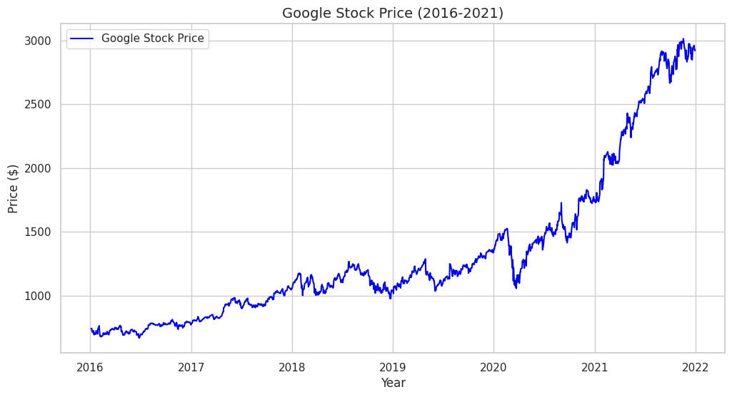
Note:
# Look at the plot. It has a clear upward trend. The mean is changing over time.
# This is a classic Non-Stationary series.
Step 2: The Transformation (Log Returns)
To make this data usable for standard statistical models, we need to remove the trend. We will calculate Log Returns.
# 3. Calculate Log Returns
# r_t = ln(P_t) - ln(P_{t-1})
df['Log_Ret'] = np.log(df['GOOGLE']).diff()

# Drop the first NaN value created by differencing
df_clean = df.dropna()

# 4. Visualize the Returns (Stationary)
plt.figure(figsize=(12, 6))
plt.plot(df_clean['Log_Ret'], label='Log Returns', color='green', alpha=0.7)
plt.title('Google Daily Log Returns', fontsize=14)
plt.xlabel('Year')
plt.ylabel('Log Return')
plt.legend()
plt.show()
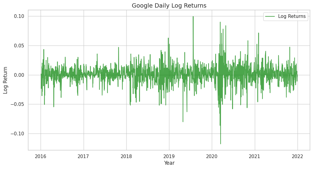
Note:
# Notice the difference? The series now oscillates around a constant mean (zero).
# While there are clusters of volatility (variance changes slightly), this is much closer to a Stationary series.
Step 3: Visual Diagnostics (ACF and PACF)
Now, let’s look at the “fingerprint” of the data using ACF and PACF plots. We will look at the returns, as they are stationary.
# 5. Plotting ACF and PACF
fig, (ax1, ax2) = plt.subplots(2, 1, figsize=(12, 10))

# ACF Plot
# We use lags=40 to see about 2 months of trading history
plot_acf(df_clean['Log_Ret'], lags=40, ax=ax1, title='Autocorrelation (ACF) of Log Returns')
ax1.set_ylabel('Correlation')

# PACF Plot
plot_pacf(df_clean['Log_Ret'], lags=40, ax=ax2, title='Partial Autocorrelation (PACF) of Log Returns')
ax2.set_xlabel('Lag')
ax2.set_ylabel('Correlation')

plt.tight_layout()
plt.show()
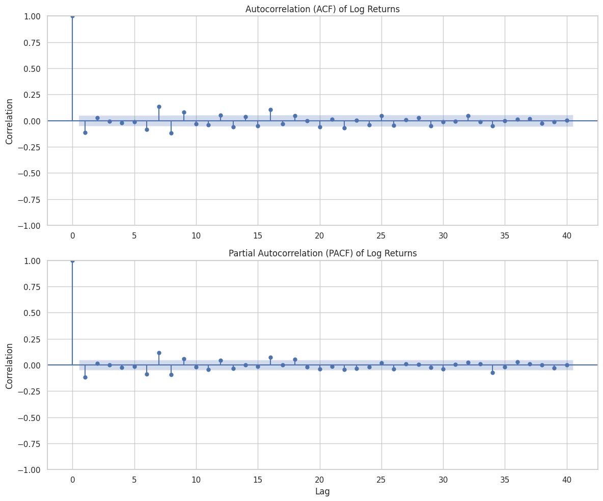
How to Read the Plots
When you run the code above, you will see two charts with blue shaded regions.
1. The Blue Cone: This is the 95% Confidence Interval. Any bar that stays inside this blue cone is statistically zero (noise). Any bar that pokes out is a significant correlation.
2. ACF interpretation: For stock returns, you will often see the ACF drop to zero almost immediately (Efficient Market Hypothesis suggestions). However, if you see a spike at Lag 1, it implies some “momentum” or “reversion” from the previous day.
3. Seasonality: If you were looking at retail sales data instead of stocks, you might see spikes at Lag 7 (weekly pattern) or Lag 12 (monthly pattern).
Conclusion
We have successfully unlocked the fourth dimension. We’ve learned that in time series, the sequence of data points holds the key to understanding the underlying process. We defined our operators ($L$ and $Delta$), explored the echo of history through Autocorrelation, and established the necessity of Stationarity for predictive modeling.
In our practical lab, we saw how raw prices which are unpredictable and trending; can be transformed into returns which are stationary and model-ready.
In the next article, we will stop just describing data and start modeling it. We will introduce the White Noise process (the building block of all models) and the Random Walk (the model that frustrates all stock pickers).
Stay tuned!