
Financial Econometrics: Part 09
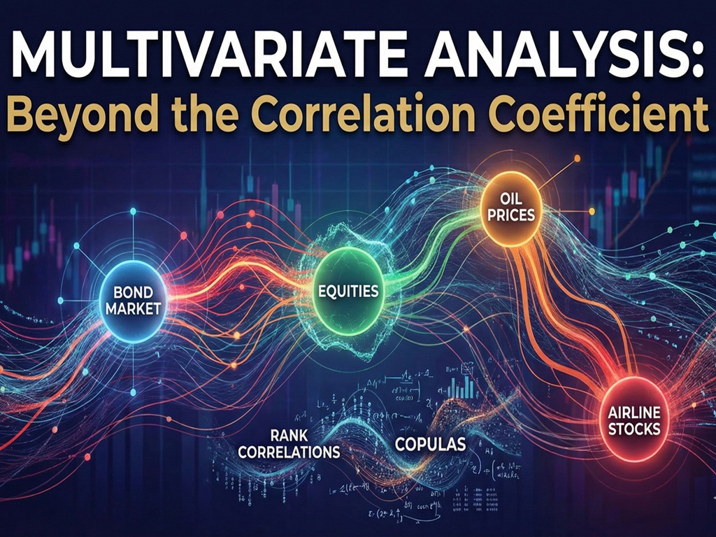
In our last article, we analyzed assets in isolation. But in financial markets, no asset is an island. A crisis in the bond market can bleed into equities; a spike in oil prices can drag down airline stocks.
To build a robust portfolio, we must understand Multivariate Analysis: the study of how variables move together. This article moves beyond the simple “Correlation Coefficient” to explore the deeper, often hidden structures of dependence using Rank Correlations and Copulas.
1. The Trap of Linear Correlation (Pearson)
When a trader asks, “What is the correlation?” they are almost always referring to the Pearson Correlation Coefficient ($rho$).
What it Measures
Pearson correlation measures the strength of the Linear Relationship between two variables.
- +1: Perfect positive linear relationship.
- -1: Perfect negative linear relationship.
- 0: No linear relationship.
The Problem
Financial relationships are rarely perfectly linear. They are noisy, messy, and prone to outliers.
- Outlier Sensitivity: A single extreme data point (like a flash crash) can massively distort the Pearson coefficient, making two unrelated assets look correlated, or vice versa.
- Non-Linearity: Two assets can be perfectly dependent but have zero Pearson correlation. Think of a shape like a parabola ($Y = X^2$). If $X$ is normally distributed around 0, the Pearson correlation between $X$ and $Y$ is zero, yet $Y$ is entirely determined by $X$.
Takeaway: Pearson is a useful starting point, but it is “brittle.” It breaks easily when assumptions of linearity and normality are violated.
2. Robust Alternatives: Rank Correlations
To fix the brittleness of Pearson, we turn to Rank Correlations. These methods do not care about the specific values (e.g., return of -5% vs -20%); they only care about the order (Rank) of the data.
Spearman’s Rho ($rho_s$)
This is simply the Pearson correlation calculated on the ranks of the data rather than the raw values.
- It assesses Monotonic Relationships: Does $Y$ generally increase when $X$ increases? It doesn’t need to be a straight line; it just needs to be a consistent trend.
- Robustness: Because it uses ranks, an outlier of -50% is treated simply as “the lowest value,” preventing it from skewing the entire calculation.
Kendall’s Tau ($tau$)
Kendall’s Tau is often preferred for smaller datasets or when hypothesis testing is critical. It is based on Concordance.
- Concordant Pair: If Stock A goes up and Stock B goes up (agreement).
- Discordant Pair: If Stock A goes up but Stock B goes down (disagreement).
$$tau = frac{(text{Number of Concordant Pairs}) – (text{Number of Discordant Pairs})}{text{Total Pairs}}$$
If $tau = 1$, the rankings are identical. If $tau = -1$, one ranking is the reverse of the other.
3. Joint Probability: The Full Picture
Correlation reduces the relationship between two assets to a single number. Joint Probability Distributions give us the full map.
Imagine a 3D mountain range.
- The Marginal Distributions (what we studied in last article) are the shadows cast on the walls; they tell us about the behavior of Asset A and Asset B individually.
- The Joint Distribution is the mountain itself. It tells us the probability of Asset A being $x$ AND Asset B being $y$ at the same time.
In finance, we often care most about the “corners” of this map, the Tails.
- Tail Dependence: This measures the probability of simultaneous extreme events. For example, “What is the probability that Bonds crash given that Stocks have already crashed?”
- Standard Normal distributions assume Tail Dependence is zero (extreme events don’t happen together). Real markets prove this wrong every decade.
4. The Copula Revolution
How do we build these complex Joint Distributions? Enter the Copula.
The word “Copula” comes from the Latin for “link” or “tie.” In statistics, a Copula is a function that binds marginal distributions together to form a joint distribution.
Sklar’s Theorem
This is the fundamental theorem of Copulas. It states that any joint distribution can be decomposed into two parts:
- The Marginals: The individual behavior of each asset (e.g., Stock A is Skew-Normal, Stock B is Student-t).
- The Copula: The dependence structure that glues them together.
$$F_{XY}(x, y) = C(F_X(x), F_Y(y))$$
Why is this revolutionary?
It allows for “Mix and Match” modeling.
- You can model the Dow Jones with a Fat-Tailed distribution (Student-t).
- You can model Treasury Yields with a Skewed distribution.
- You can then use a Clayton Copula (which has strong lower-tail dependence) to glue them together.
This creates a model where assets behave normally most of the time but crash together during a panic; a much more realistic simulation of financial markets than simple correlation.
5. Practical Application: The Empirical Copula
In the attached Python script, we visualize the Empirical Copula of the Dow Jones and 10-Year Treasury Yields.
The Probability Integral Transform (PIT)
To see the Copula, we strip away the “shape” of the individual data (returns) by converting them to Uniform Quantiles [0, 1].
- A value of 0.95 means “this return is in the top 5% of historical data.”
- A value of 0.05 means “this return is in the bottom 5%.”
![Scatter plot illustrating the Empirical Copula of the Dow Jones (DWJ) and 10-Year Treasury Yields (10Y_TBY), transformed to a uniform scale [0,1].](https://i0.wp.com/simplified-zone.com/wp-content/uploads/2025/11/image-8.webp?resize=868%2C884&ssl=1)
Interpreting the Plot:
- Independence: Points are scattered randomly like star dust (Uniform distribution).
- Perfect Correlation: Points form a straight diagonal line.
- Tail Dependence: You see clusters in the bottom-left (both crash) or top-right corners.
Summary
- Correlation (Pearson) is a blunt tool that misses non-linear risks.
- Rank Correlations (Spearman/Kendall) are more robust to outliers and measure monotonic trends.
- Copulas allow us to separate the behavior of individual assets from their relationship with each other, enabling us to model the dangerous “tail events” where diversification often fails.
In the next article, we will leave the world of static distributions and enter the dynamic world of Time Series, exploring Stationarity, Autocorrelation, and White Noise.
import pandas as pd
import numpy as np
import matplotlib.pyplot as plt
import seaborn as sns
import scipy.stats as stats

# Set visual style
sns.set_theme(style="whitegrid")
plt.rcParams['figure.figsize'] = (12, 8)

def load_data(filepath):
    """
    Loads data and selects Dow Jones (DWJ) and 10Y Treasury Bond Yields (10Y_TBY).
    """
    try:
        df = pd.read_csv(filepath)
        # Select relevant columns and drop NaNs
        # We use 10Y_TBY to see the relationship between Equities and Rates
        data = df[['DWJ', '10Y_TBY']].dropna()
        return data
    except Exception as e:
        print(f"Error loading data: {e}")
        return None

def analyze_correlations(data):
    """
    Calculates and compares Pearson, Spearman, and Kendall correlations.
    """
    pearson = data.corr(method='pearson').iloc[0, 1]
    spearman = data.corr(method='spearman').iloc[0, 1]
    kendall = data.corr(method='kendall').iloc[0, 1]

    print("n--- Correlation Analysis (DWJ vs 10Y_TBY) ---")
    print(f"Pearson (Linear):   {pearson:.4f}")
    print(f"Spearman (Rank):    {spearman:.4f}")
    print(f"Kendall (Tau):      {kendall:.4f}")

    return pearson, spearman, kendall

def visualize_joint_distribution(data):
    """
    Visualizes the Joint Distribution using a Kernel Density Estimate (KDE).
    This shows where the 'mass' of the data is concentrated.
    """
    g = sns.jointplot(x='DWJ', y='10Y_TBY', data=data, kind="kde", fill=True, cmap="Blues")
    g.fig.suptitle('Joint Distribution: DWJ vs 10Y Treasury Yields', y=1.02)
    plt.show()

def visualize_copula_transform(data):
    """
    Demonstrates the Probability Integral Transform (PIT).
    Converts raw returns into Uniform[0,1] values to visualize the Empirical Copula.
    """
    # Rank data and normalize to (0, 1)
    # This removes the marginal distribution shape (bell curve) and leaves only the dependence structure
    u_dwj = stats.rankdata(data['DWJ']) / (len(data) + 1)
    u_10y = stats.rankdata(data['10Y_TBY']) / (len(data) + 1)

    plt.figure(figsize=(10, 10))
    plt.scatter(u_dwj, u_10y, alpha=0.2, s=10, color='darkgreen')
    plt.title('Empirical Copula (Pseudo-Observations)nData Transformed to Uniform Scale [0,1]')
    plt.xlabel('DWJ (Uniform Quantile)')
    plt.ylabel('10Y_TBY (Uniform Quantile)')
    plt.axhline(0.5, color='gray', linestyle='--')
    plt.axvline(0.5, color='gray', linestyle='--')
    plt.xlim(0, 1)
    plt.ylim(0, 1)
    plt.show()

def calculate_tail_dependence(data, quantile=0.05):
    """
    Estimates Lower Tail Dependence:
    P(Y < q | X < q) = P(X < q and Y < q) / P(X < q)
    """
    # Define threshold values
    q_dwj = data['DWJ'].quantile(quantile)
    q_10y = data['10Y_TBY'].quantile(quantile)

    # Count occurrences
    both_crash = len(data[(data['DWJ'] < q_dwj) & (data['10Y_TBY'] < q_10y)])
    dwj_crash = len(data[data['DWJ'] < q_dwj])

    if dwj_crash == 0:
        tail_dep = 0
    else:
        tail_dep = both_crash / dwj_crash

    print(f"n--- Empirical Lower Tail Dependence (q={quantile}) ---")
    print(f"Probability of 10Y Yield dropping significantly GIVEN Dow Jones drops significantly: {tail_dep:.2%}")

if __name__ == "__main__":
    file_path = 'data.csv'

    df_clean = load_data(file_path)

    if df_clean is not None:
        analyze_correlations(df_clean)
        visualize_joint_distribution(df_clean)
        visualize_copula_transform(df_clean)
        calculate_tail_dependence(df_clean)