
Machine Learning for Quants (Part 6):
Introduction
In last part, we used clustering to group rows of data (assets) based on their features. But what do we do when we have too many columns (features) that are highly correlated?
In quantitative finance, using dozens of highly correlated variables (like the yields of 1-month, 3-month, 1-year, 2-year, 5-year, and 10-year Treasury bonds) leads to multicollinearity. This confuses predictive models and slows down computations.
Enter Dimensionality Reduction. In this tutorial, we will use Principal Component Analysis (PCA) to compress a complex dataset into its most essential underlying factors. We will apply this to a classic fixed-income problem: modeling the US Treasury Yield Curve. Amazingly, we will see that the algorithm naturally rediscovers the three fundamental forces of bond markets: Level, Slope, and Curvature.
Learning Objectives
By the end of this tutorial, you will be able to:
- Explain the mathematical intuition behind Principal Component Analysis (PCA).
- Download and preprocess real-world interest rate data using the Federal Reserve’s FRED database.
- Apply PCA using scikit-learn to compress the dimensions of the yield curve.
- Visualize and interpret the Principal Components (Loadings) as recognizable market shifts.
Prerequisites
- Previous Knowledge: Basic Python, understanding of scaling (StandardScaler).
- Libraries: scikit-learn, pandas, numpy, matplotlib.
- New Library: pandas_datareader (used to easily pull free economic data from FRED).
Installation Command:
pip install pandas-datareader scikit-learn pandas numpy matplotlib
Core Concepts
1. The Curse of Dimensionality & Multicollinearity
Imagine you want to predict the economy, so you feed an algorithm the prices of 100 different tech stocks. Because tech stocks generally move together, you aren’t actually giving the model 100 distinct pieces of information; you are giving it the same information 100 times. This is multicollinearity. Dimensionality reduction techniques compress these 100 variables down to 1 or 2 “true” underlying factors.
2. Principal Component Analysis (PCA)
PCA is a mathematical technique that transforms a dataset of correlated variables into a smaller set of uncorrelated variables called Principal Components (PCs).
- How it works: Imagine a 3D cloud of data points shaped like a cigar. PCA finds the longest axis through the cigar (the direction of maximum variance) and calls it “Component 1”. It then finds a second axis, perpendicular (orthogonal) to the first, capturing the next most variance, and calls it “Component 2”.
- The Goal: We can drop the minor components and keep only the top few, retaining 95%+ of the original information but with a fraction of the variables.
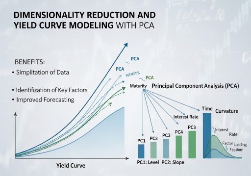
3. The Yield Curve Application
The Yield Curve plots the interest rates of bonds with equal credit quality but differing maturity dates. Because short-term and long-term rates generally move together, the yield curve is perfectly suited for PCA. Financial theory tells us the curve moves in three ways:
- Level (Shift): All rates move up or down together.
- Slope (Twist): Short-term rates rise while long-term rates fall (flattening), or vice versa (steepening).
- Curvature (Butterfly): Medium-term rates move independently of short and long-term rates.
Let’s see if our unsupervised ML model can discover these financial concepts purely from raw data.
Step-by-Step Walkthrough (The Hands-On Practice)
Step 1: Fetching Treasury Yield Data
We will use pandas_datareader to download historical Constant Maturity Treasury (CMT) rates directly from the St. Louis Fed (FRED).
import pandas as pd
import numpy as np
import matplotlib.pyplot as plt
import pandas_datareader.data as web
import datetime

# Define the exact FRED ticker symbols for various maturities
tickers = ['DGS1MO', 'DGS3MO', 'DGS6MO', 'DGS1', 'DGS2', 'DGS3', 'DGS5', 'DGS7', 'DGS10', 'DGS20', 'DGS30']
labels = ['1M', '3M', '6M', '1Y', '2Y', '3Y', '5Y', '7Y', '10Y', '20Y', '30Y']

# Fetch 10 years of data
start_date = datetime.datetime(2016, 1, 1)
end_date = datetime.datetime(2026, 1, 1)

print("Fetching data from FRED...")
yield_data = web.DataReader(tickers, 'fred', start_date, end_date)

# Rename columns for readability and drop any days with missing data (like holidays)
yield_data.columns = labels
yield_data.dropna(inplace=True)

print(f"Data Loaded: {yield_data.shape[0]} trading days, {yield_data.shape[1]} maturities.")
print(yield_data.head())

Step 2: Preprocessing (Differencing and Scaling)
Critical Quant Step: Interest rates are non-stationary (they trend). PCA should generally be applied to stationary data. Therefore, we will analyze the daily changes in yields (basis point moves) rather than the absolute yield levels.
from sklearn.preprocessing import StandardScaler

# 1. Calculate daily changes in yields
yield_changes = yield_data.diff().dropna()

# 2. Standardize the data
# PCA is highly sensitive to the scale of features. We must center the data (mean=0, variance=1).
scaler = StandardScaler()
X_scaled = scaler.fit_transform(yield_changes)

# Convert back to DataFrame for easier plotting later
X_scaled_df = pd.DataFrame(X_scaled, columns=labels, index=yield_changes.index)

print("First 5 rows of scaled yield changes:")
print(X_scaled_df.head())
Step 3: Fitting the PCA Model
We will ask the PCA algorithm to find the underlying components. Since we have 11 original variables (maturities), we can technically generate up to 11 components. Let’s calculate all of them first to see how much variance each explains.
from sklearn.decomposition import PCA

# Initialize PCA (keeping all components initially)
pca = PCA()

# Fit to the scaled data
pca.fit(X_scaled)

# Get the "Explained Variance Ratio" - how much information does each component hold?
explained_variance = pca.explained_variance_ratio_

print("Explained Variance Ratio by Component:")
for i, var in enumerate(explained_variance):
    print(f"PC{i+1}: {var:.4f} ({var*100:.2f}%)")

# Calculate cumulative variance
cumulative_variance = np.cumsum(explained_variance)
print(f"\nCumulative Variance of Top 3 Components: {cumulative_variance[2]*100:.2f}%")

You see that the first 3 components explain roughly 88-89% of all the movement in the yield curve! We have successfully compressed 11 variables down to 3.
Step 4: Visualizing the PCA “Loadings”
To understand what these components represent, we must look at their Loadings (eigenvectors). This tells us how much each original maturity contributes to the new principal component.
# Extract the loadings (weights) for the first 3 principal components
loadings = pca.components_[:3]

# Create a DataFrame for easy plotting
loadings_df = pd.DataFrame(loadings.T, columns=['PC1 (Level)', 'PC2 (Slope)', 'PC3 (Curvature)'], index=labels)

# Plot the Loadings
plt.figure(figsize=(10, 6))
plt.plot(loadings_df['PC1 (Level)'], marker='o', label='PC1: Level (Parallel Shift)')
plt.plot(loadings_df['PC2 (Slope)'], marker='s', label='PC2: Slope (Twist)')
plt.plot(loadings_df['PC3 (Curvature)'], marker='^', label='PC3: Curvature (Butterfly)')

plt.axhline(0, color='black', linestyle='--', alpha=0.5)
plt.title('PCA Loadings of the US Treasury Yield Curve')
plt.xlabel('Maturity')
plt.ylabel('Loading (Weight)')
plt.legend()
plt.grid(True)
plt.show()

Step 5: Interpretation
Look closely at the graph generated in Step 4:
- PC1 (Blue Line): The line is relatively flat and entirely positive. If PC1 increases, all maturities increase together. The algorithm has discovered “Level”.
- PC2 (Orange Line): The line crosses zero. Short-term weights are positive, long-term weights are negative. This means short rates and long rates are moving in opposite directions. The algorithm has discovered “Slope”.
- PC3 (Green Line): The line is hump-shaped. Short and long weights are positive, but the middle (e.g., 6M to 5Y) is negative. The middle bends independently of the ends. The algorithm has discovered “Curvature”.
Verification & Independent Practice
Check Your Work
- Variance Check: In Step 3, verify that PC1 captures the vast majority of the variance (usually ~70%), PC2 captures ~10, and PC3 captures ~2-5%.
- Loading Shapes: Ensure your plot in Step 4 clearly shows a relatively flat line (PC1), a sloped line crossing zero (PC2), and a U-shaped or hump-shaped line (PC3).
Challenge: Creating the Factor Time Series
We know what the components look like, but what were their daily values?
Use pca.transform(X_scaled) to calculate the daily values of the principal components for the entire historical period. Plot the time series of PC1 (Level) over the 10-year period. Does it visually match the historical rise and fall of general interest rates?
Conclusion & Next Steps
In this tutorial, we used PCA to tackle the Curse of Dimensionality. We proved that despite the Yield Curve consisting of 11+ different maturity points, it is fundamentally driven by just 3 underlying factors: Level, Slope, and Curvature.
By feeding just these 3 Principal Components into a predictive algorithm (instead of 11 highly correlated yields), we eliminate multicollinearity, reduce noise, and create a much more stable trading model.
Next Steps: We have mastered regressions, classifications, clustering, and PCA. In Part 7, we will dive into Tree-Based Models. We will explore Decision Trees, Random Forests, and XGBoost; the undisputed champions of tabular data in modern quantitative finance.
Troubleshooting / FAQ
Q: Why did we calculate the difference (diff()) of the yields instead of using the raw percentages?
A: Yields are non-stationary (they tend to wander aimlessly over long periods). If you run PCA on raw yields, the model will just capture the macro trend of the decade rather than the daily structural dynamics of the curve. By taking the daily change, we ensure the data is stationary, analyzing how the curve moves day-to-day.
Q: Why is scaling (StandardScaler) necessary for PCA?
A: PCA looks for the direction of maximum variance. If one variable is measured in thousands (e.g., DOW Jones index) and another in small decimals (e.g., Yields), the algorithm will think the larger numbers represent more variance. Scaling puts everything on an equal playing field (mean=0, variance=1) so the algorithm finds true structural variance, not just scale differences.
Q: Can I use PCA on stock returns?
A: Absolutely. If you run PCA on the S&P 500 constituents, you will find that PC1 almost perfectly represents the overall “Market Direction” (Beta), PC2 might represent “Value vs. Growth”, and so on. This is called Statistical Risk Modeling.