
Machine Learning for Quants (Part 5)
Introduction
Till now, we focused on Supervised Learning: we gave the model inputs (X) and the correct answers (y) to teach it to predict returns or credit defaults.
But what if we don’t have a “correct answer”? What if we just have a massive pile of data and want to know, “How is this organized?”
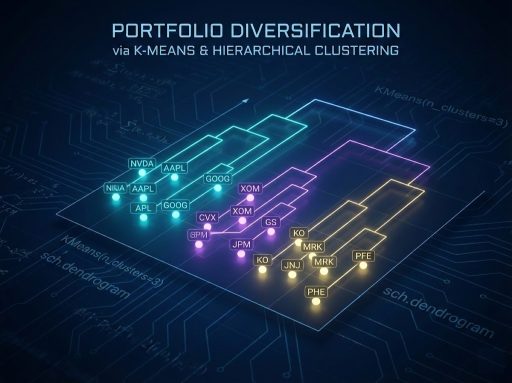
This is Unsupervised Learning. In this tutorial, we explore Clustering Algorithms. For Quants, clustering is the mathematical foundation of Portfolio Diversification. Instead of relying on arbitrary sector labels (e.g., “Tech” vs. “Utilities”), we let the data tell us which assets move together.
Learning Objectives
By the end of this tutorial, you will be able to:
- Distinguish between Supervised and Unsupervised learning workflows.
- Apply K-Means Clustering to group assets based on their Risk/Return profiles.
- Determine the optimal number of clusters using the Elbow Method and Silhouette Score.
- Visualize Asset Hierarchies using Dendrograms (Hierarchical Clustering) to build robust portfolios.
Prerequisites
- Previous Knowledge: Basic Python and pandas data manipulation.
- Libraries: scikit-learn, pandas, numpy, matplotlib, scipy, yfinance.
Core Concepts
1. K-Means Clustering
K-Means is an algorithm that partitions data into K distinct, non-overlapping groups (clusters).
- How it works: It selects K random center points (“centroids”). It assigns every data point to the nearest centroid, then recalculates the centroid based on the average of the new group. It repeats this until the groups stop changing.
- Quant Application: Grouping 500 stocks into 10 “regimes” or “styles” based on volatility, beta, and momentum.
2. The Elbow Method
K-Means requires you to choose K (the number of clusters) beforehand. How do you know if 3 is better than 5?
- We calculate the Inertia (sum of squared distances from points to their centroids).
- As we add more clusters, Inertia drops. We look for the “Elbow” in the plot; the point where adding another cluster gives diminishing returns.
3. Hierarchical Clustering
Unlike K-Means, this method doesn’t force you to pick K. It builds a tree of relationships.
- Agglomerative: Starts with every point as its own cluster and merges the two closest points iteratively until only one giant cluster remains.
- Dendrogram: A tree diagram showing the arrangement of the clusters produced by the corresponding analyses. In finance, this visualizes the “family tree” of assets.
The Hands-On Practice
Step 1: Data Acquisition (Building a Basket)
We will download data for a diverse basket of stocks to see if the algorithms can correctly identify their “types” (e.g., Tech vs. Energy vs. Bonds) purely from the data.
import numpy as np
import pandas as pd
import yfinance as yf
import matplotlib.pyplot as plt
import seaborn as sns

# Define a basket of diverse tickers
# Tech (AAPL, MSFT), Energy (XOM, CVX), Defensive (KO, JNJ), Banks (JPM, BAC)
tickers = ['AAPL', 'MSFT', 'GOOGL', 'AMZN', 'NVDA',  # Tech
           'XOM', 'CVX', 'COP',                      # Energy
           'KO', 'JNJ', 'PG',                        # Defensive/Staples
           'JPM', 'BAC', 'GS']                       # Financials

# Download 2 years of data
data = yf.download(tickers, start='2024-01-01', end='2026-01-01')['Close']

# Calculate Daily Returns
returns = data.pct_change().dropna()

print(f"Data Shape: {returns.shape}")
print(returns.head())
Step 2: Feature Engineering (Risk vs. Reward)
Clustering requires features. We will map each stock to a 2D coordinate: Annualized Return (Reward) vs. Annualized Volatility (Risk).
# 1. Calculate Annualized Mean Return (approx 252 trading days)
mean_returns = returns.mean() * 252

# 2. Calculate Annualized Volatility (Standard Deviation)
volatility = returns.std() * np.sqrt(252)

# 3. Create a DataFrame for Features
features = pd.DataFrame()
features['Return'] = mean_returns
features['Volatility'] = volatility
features.index = mean_returns.index

print(features.head())

# Visualization before Clustering
plt.figure(figsize=(10, 6))
plt.scatter(features['Volatility'], features['Return'])

# Annotate points
for i, txt in enumerate(features.index):
    plt.annotate(txt, (features['Volatility'].iloc[i], features['Return'].iloc[i]))

plt.xlabel('Annualized Volatility (Risk)')
plt.ylabel('Annualized Return')
plt.title('Risk vs Return of Selected Assets')
plt.grid(True)
plt.show()

Step 3: K-Means Clustering and the Elbow Method
Now we group these stocks. But first, we must standardize the data.
from sklearn.cluster import KMeans
from sklearn.preprocessing import StandardScaler

# 1. Scale the Data (Crucial for K-Means)
# If we don't scale, Volatility (0.20) and Return (0.15) might be comparable,
# but if we added "Price" (150.0), it would dominate the distance calculation.
scaler = StandardScaler()
X_scaled = scaler.fit_transform(features)

# 2. Elbow Method to find optimal K
inertia = []
k_range = range(1, 10)

for k in k_range:
    kmeans = KMeans(n_clusters=k, random_state=42, n_init=10)
    kmeans.fit(X_scaled)
    inertia.append(kmeans.inertia_)

# Plot Elbow
plt.figure(figsize=(8, 4))
plt.plot(k_range, inertia, marker='o')
plt.title('Elbow Method')
plt.xlabel('Number of Clusters (k)')
plt.ylabel('Inertia')
plt.grid(True)
plt.show()
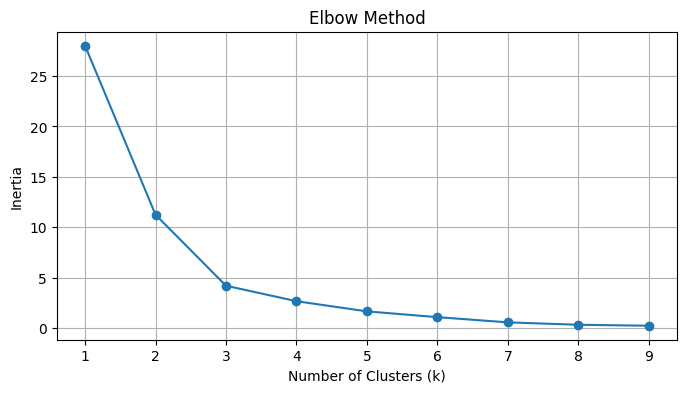
Interpretation: You see an “elbow” (bend) around k=3. This suggests the data naturally splits into 3.
Step 4: Applying K-Means
Let’s choose k = 3 (representing distinct asset classes) and visualize the results.
# Apply K-Means with chosen k
k = 3
kmeans = KMeans(n_clusters=k, random_state=42, n_init=10)
clusters = kmeans.fit_predict(X_scaled)

# Add Cluster labels to original data
features['Cluster'] = clusters

# Visualize Clusters
plt.figure(figsize=(10, 6))
# Plot each cluster with a different color
sns.scatterplot(data=features, x='Volatility', y='Return', hue='Cluster', palette='viridis', s=100)

for i, txt in enumerate(features.index):
    plt.annotate(txt, (features['Volatility'].iloc[i], features['Return'].iloc[i]))

plt.title(f'K-Means Clustering (k={k})')
plt.grid(True)
plt.show()

# Show which stocks are in which cluster
for i in range(k):
    print(f"\nCluster {i}:")
    print(features[features['Cluster'] == i].index.tolist())


Step 5: Hierarchical Clustering (Dendrograms)
K-Means forces every point into a hard group. Hierarchical clustering shows the distance between assets. This is widely used in “Hierarchical Risk Parity” (HRP) portfolio construction.
from scipy.cluster.hierarchy import dendrogram, linkage

# 1. Compute Linkage Matrix (Ward's method minimizes variance within clusters)
# We use the SCALED data (X_scaled)
Z = linkage(X_scaled, method='ward')

# 2. Plot Dendrogram
plt.figure(figsize=(12, 6))
dendrogram(
    Z,
    labels=features.index,
    leaf_rotation=90,
    leaf_font_size=12,
)
plt.title('Hierarchical Clustering Dendrogram')
plt.xlabel('Assets')
plt.ylabel('Euclidean Distance')
plt.show()
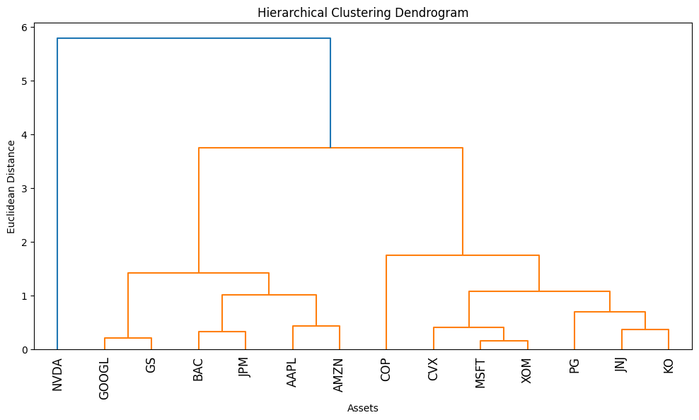
Interpretation: The vertical height of the U-shaped links represents distance. Stocks linked at a low height (short vertical lines) are highly similar. Branches that don’t meet until the top are very different.
Verification & Independent Practice
Check Your Work
- Scaling: Did you scale the data in Step 3? If you skip scaling, high-volatility assets might bias the clustering.
- Elbow Plot: Does your plot look like a hockey stick? If it’s a straight line, your data might be too random or too uniform.
- Logical Grouping: Look at the clusters in Step 4. Did XOM and CVX (Energy) end up in the same cluster? Did KO and JNJ (Defensive) group together? They should.
Challenge: 3D Clustering
We clustered on Return and Volatility. Add a third dimension: Beta (correlation to SPY).
- Calculate Beta for each stock against SPY.
- Add it to the features DataFrame.
- Re-run K-Means. Does adding Beta change which stocks group together? (Hint: Defensive stocks usually have low Beta, Tech has high Beta).
Conclusion & Next Steps
In this tutorial, we abandoned labels and let the data speak for itself.
- K-Means helped us categorize assets into distinct “risk-return regimes.”
- Hierarchical Clustering revealed the “family tree” of our portfolio, showing us which assets are closely related cousins and which are distant strangers.
This is the bedrock of diversification. If you own 10 stocks but they all sit in “Cluster 1” of your dendrogram, you aren’t diversified; you’re just betting on Cluster 1 10 times.
Next Steps: Clustering works on rows (observations). But what if we have too many columns (features)? In Part 6, we will tackle Dimensionality Reduction (PCA) to model complex systems like the Bond Yield Curve.
Troubleshooting / FAQ
Q: My K-Means clusters change every time I run the code.
A: K-Means starts with random centroids. If the data isn’t clearly separated, different starting points lead to different results. Always set random_state=42 (or any fixed number) to ensure reproducibility.
Q: Why do we use Ward’s Linkage?
A: There are other methods (Single, Complete, Average). ‘Single’ tends to create long, stringy chains. ‘Ward’ tries to create compact, spherical clusters, which generally makes more sense for grouping financial assets.
Q: Can I cluster using just Price history?
A: No. Prices are not stationary (they go up over time). AAPL at $150 and MSFT at $300 are not “different” just because of the price tag. Always cluster on Returns or derived features (Volatility, Beta, Sharpe Ratio).