A Comprehensive and Critical Analysis of Probability Distributions in Quantitative Finance
1. Introduction: The Cartography of Risk
In the grand, chaotic theatre of global finance, uncertainty is the only constant. From the frenetic ticking of high-frequency trading algorithms to the glacial movements of macroeconomic cycles, the financial practitioner is tasked with a singular, Herculean challenge: to impose mathematical order upon human unpredictability. This endeavour requires a map, a way to describe not just what might happen, but how likely it is to happen. These maps are probability distributions.
To the uninitiated, a probability distribution is merely a curve on a graph, a static shape defined by obscure Greek letters. But to the quantitative analyst (“quant”), risk manager, or derivatives trader, these distributions are living entities. They possess personalities, quirks, and temperaments. Some, like the Normal distribution, are the dependable workhorses of the industry, offering mathematical convenience and a comforting (if deceptive) sense of symmetry. Others, like the Cauchy or the Levy, are the wild beasts of the statistical jungle; unruly, volatile, and prone to “fat-tailed” behaviour that can wreck portfolios and topple institutions.
This book serves as an exhaustive field guide to this stochastic menagerie. Based on the foundational classifications and enriched by a broad spectrum of contemporary financial literature, we will dissect the anatomical structures (probability density functions), behavioural traits (moments and limiting properties), and habitats (financial applications) of the most important distributions in finance.
We will traverse the familiar bell curves of the Gaussian world, wade into the dangerous waters of Extreme Value Theory, and explore the mathematical oddities that, while “rarely used,” offer profound insights into the nature of randomness. Along the way, we will employ analogies ranging from drunk sailors to broken chains, demonstrating that behind the rigorous facade of stochastic calculus lies a deep, and often humorous, attempt to understand the vagaries of fortune.
2. The Gaussian Foundation
The bedrock of modern financial theory is built upon the assumption of normality. While frequently criticized for its failure to capture the wildest of market tantrums, the Gaussian family remains the starting point for any serious quantitative discussion. It represents the idealized world of finance: frictionless, continuous, and analytically tractable.
2.1 The Normal (Gaussian) Distribution
The Normal distribution, or Gaussian, is the celebrity of the statistical world. Its bell-shaped curve is instantly recognizable, representing the “average” behavior of everything from the heights of schoolboys to the errors in astronomical observations. In finance, it is the canvas upon which the picture of Modern Portfolio Theory is painted.

Figure 1
2.1.1 Mathematical Architecture
The Normal distribution is defined by its perfect symmetry and its infinite span. It is unbounded, extending theoretically from -∞ to +∞, implying that any value, no matter how extreme, is possible (though exponentially unlikely).
The distribution is governed by two parameters:
- Location (a): The center of the distribution, representing the mean.
- Scale (b > 0): The spread of the curve, analogous to standard deviation.
The Probability Density Function (PDF) is given by the classic formula:
$$P(x) = \frac{1}{\sqrt{2\pi}b} e^{-\frac{(x-a)^2}{2b^2}}$$
The moments of the distribution define its character:
- Mean: a
- Variance: b2
2.1.2 The Central Limit Theorem: The Source of Power
The ubiquity of the Normal distribution in finance is not merely a matter of convenience; it is a consequence of the Central Limit Theorem (CLT). The CLT states that the sum of a large number of independent, identically distributed random variables; regardless of their original distribution, will tend toward a Normal distribution.
This is a profound insight for modeling equity returns. If we view the daily return of a stock as the aggregate result of thousands of small, independent trades and news events, the CLT suggests that these returns should be Normally distributed. This assumption allows quants to model price changes using diffusion processes, leading directly to the heat equations and deterministic solutions that characterize the Black-Scholes universe.
Furthermore, the Normal distribution is the standard model for errors in observations. In econometrics and regression analysis, the “noise” obscuring the “signal” is almost always assumed to be Gaussian. This is mathematically defensible because error terms often result from the sum of many minor, unobservable influences.
2.1.3 The “Spherical Cow” of Finance
Despite its mathematical elegance, the Normal distribution is often mocked as the “spherical cow” of finance; a simplification that works in the classroom but fails in the field. Real markets exhibit leptokurtosis (fat tails) and skewness. The Normal distribution assigns a vanishingly small probability to events beyond five standard deviations (5-sigma). Yet, in the financial markets, 5-sigma events (crashes, devaluations, flash crashes) occur with alarming regularity. Relying solely on the Normal distribution for risk management is akin to building a levee that withstands the average tide but crumbles before the storm surge. It captures the “body” of market movements perfectly but fails to describe the “tails,” where the true danger lies.
2.1.4 Hands-On
The Scenario
In this example, we act as a Quantitative Analyst trying to model the daily behavior of a volatile stock. We assume the returns follow a Normal Distribution. We want to visualize what this looks like and calculate the likelihood of a “3-sigma” event (a significant market move).
The Code Explained
We use Python’s numpy for calculation and matplotlib for visualization.
Step A: Defining the Parameters
First, we define the “personality” of our distribution.
- loc (Location/Mean): We set this to 0.0005 (0.05%), representing a small positive drift in the stock price over time.
- scale (Scale/Volatility): We set this to 0.02 (2%). This is the standard deviation. A higher number means a “fatter” bell curve.
Step B: Generating the Data
daily_returns = np.random.normal(loc=mean_daily_return, scale=volatility, size=num_days)
The np.random.normal function is the digital equivalent of rolling dice. It generates 10,000 days of hypothetical returns based on the rules of the Normal distribution.
Step C: The Histogram vs. The Curve
This is the most critical visual.
- The Histogram (Blue Bars): This represents the empirical data, the “noisy” reality of our simulation.
- The Red Line: This is the Probability Density Function (PDF), the distinct mathematical formula:
Px=12πbe-x-a22b2
We plot this to see how well reality fits the theory. In a perfect Normal world, the blue bars should align perfectly under the red line.
Figure 2
Key Takeaway: The 3-Sigma Rule
The dashed lines are drawn at μ- 3σ and μ+ 3σ.
- The Theory: In a Normal distribution, 99.7% of all events should fall between these lines. Events outside these lines (the “tails”) are extremely rare.
- The Output: The script prints the number of “Crash Days” (days where returns fell below -3 σ).
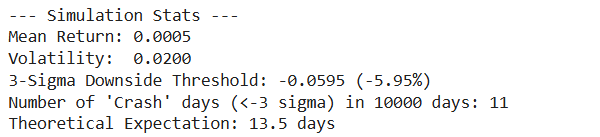
Discussion: If you run this on real S&P 500 data (instead of synthetic Normal data), you would see far more “Crash Days” than the Normal distribution predicts. This proves that real markets have “fat tails” (Leptokurtosis).
Complete Code
import numpy as np
import matplotlib.pyplot as plt
import scipy.stats as stats
# ==========================================
# Hands-On: The Normal Distribution
# Context: Modeling Daily Stock Returns
# ==========================================
def run_normal_distribution_simulation():
# 1. Setup Parameters
# ——————-
# We simulate a year of trading (252 days) for a volatile stock.
# Mean return (mu) is usually close to 0 daily.
# Volatility (sigma) is the standard deviation of returns.
mean_daily_return = 0.0005 # Approx 0.05% daily return
volatility = 0.02 # 2% daily volatility (high risk)
num_days = 10000 # Simulating 10,000 days to get a smooth curve
# 2. Generate Synthetic Data
# ——————-
# We assume returns follow a Normal Distribution N(mu, sigma)
daily_returns = np.random.normal(loc=mean_daily_return,
scale=volatility,
size=num_days)
# 3. Visualization
# ——————-
plt.figure(figsize=(10, 6))
# Plot the Histogram (The “Empirical” Data)
# ‘density=True’ normalizes the count to make it comparable to the PDF
count, bins, ignored = plt.hist(daily_returns,
bins=50,
density=True,
alpha=0.6,
color=‘#2c3e50’,
label=‘Simulated Returns’)
# Plot the Theoretical PDF (The “Ideal” Bell Curve)
# We calculate the probability density function for the x-axis range
# standard deviation (sigma) is the ‘scale’, mean is ‘loc’
plt.plot(bins,
stats.norm.pdf(bins, mean_daily_return, volatility),
linewidth=3,
color=‘#e74c3c’,
label=‘Theoretical Gaussian PDF’)
# 4. Analyze “Tail Events” (3-Sigma Rule)
# ——————-
# Calculate the 3-sigma thresholds
sigma_down = mean_daily_return – (3 * volatility)
sigma_up = mean_daily_return + (3 * volatility)
plt.axvline(sigma_down, color=‘black’, linestyle=‘–‘, label=‘-3 Sigma (Crash)’)
plt.axvline(sigma_up, color=‘black’, linestyle=‘–‘, label=‘+3 Sigma (Spike)’)
# Add labels and formatting
plt.title(‘The Gaussian Assumption: Simulated Returns vs. Theoretical Model’, fontsize=14)
plt.xlabel(‘Daily Return’, fontsize=12)
plt.ylabel(‘Probability Density’, fontsize=12)
plt.legend()
plt.grid(True, alpha=0.3)
print(f“— Simulation Stats —“)
print(f“Mean Return: {mean_daily_return:.4f}”)
print(f“Volatility: {volatility:.4f}”)
print(f“3-Sigma Downside Threshold: {sigma_down:.4f} ({(sigma_down*100):.2f}%)”)
# Calculate how many days actually fell below -3 sigma
crashes = np.sum(daily_returns < sigma_down)
print(f“Number of ‘Crash’ days (<-3 sigma) in {num_days} days: {crashes}”)
print(f“Theoretical Expectation: {num_days * (1 – stats.norm.cdf(3)):.1f} days”)
plt.show()
if __name__ == “__main__”:
run_normal_distribution_simulation()
2.2 The Lognormal Distribution
If the Normal distribution describes returns, the Lognormal distribution describes prices. This distinction is critical. A stock price has a fundamental physical constraint that a Normal variable does not: limited liability. A corporation’s stock price cannot fall below zero. A Normal distribution, with its tail extending to negative infinity, could theoretically predict a price of -$20, a nonsensical outcome. The Lognormal distribution solves this by mapping the domain of real numbers to the positive half-line.
2.2.1 Mathematical Architecture
The Lognormal distribution is bounded below by 0 (x ≥0) and unbounded above. It is defined by the same parameters a and b as the Normal distribution, but they fundamentally represent the mean and standard deviation of the logarithm of the variable, not the variable itself.
The PDF is given by:
Px=12πbxexp-lnx-a22b2
The moments of the Lognormal distribution are skewed and fundamentally different from the Normal parameters:
- Mean: ea+12b2
- Variance: e2a+b2eb2-1

Figure 3
2.2.2 The Geometric Nature of Wealth
The Lognormal distribution arises naturally from the assumption of Geometric Brownian Motion. If the rate of return is Normally distributed (you gain or lose a percentage of your current wealth), then the future price must be Lognormally distributed.
Consider the “Compound Charlie” analogy. If an investor starts with $100 and gains 10%, they have $110. If they then lose 10%, they drop to $99. The arithmetic average of +10% and -10% is 0%, but the geometric reality is a loss. The Lognormal distribution captures this multiplicative dynamic, where the downside is capped at -100% (loss of all capital) but the upside is unlimited (infinite compounding).
This distribution is the standard model for equity prices, commodity prices, and exchange rates in the Black-Scholes framework. It reflects the asymmetry of financial reality: markets can only crash so far (to zero), but bubbles can inflate indefinitely. The skewness of the Lognormal distribution, a long tail to the right, corresponds to the theoretical possibility of infinite wealth accumulation.
2.2.3 Hands-On
The Scenario
In the previous module, we looked at returns, which can be positive or negative (symmetric). Now, we look at the Stock Price itself.
A stock price has two fundamental rules that distinguish it from returns:
- Limited Liability: It cannot go below $0. (You can’t lose more than you invested).
- Unlimited Upside: It can theoretically grow to infinity.
This asymmetry creates the Lognormal Distribution. We will simulate where a $100 stock might end up after one year of volatile trading.
The Code Explained
Step A: The Transformation
We start with the same volatility inputs as before, but we must transform them. In the standard Black-Scholes model, if returns are Normal, prices are Lognormal.
The crucial formula inside the code is:
normal_mean = np.log(S0) + (mu – 0.5 * sigma**2)
This adjustment (- 0.5 * sigma^2) is a mathematical necessity called Itô’s Lemma correction. It accounts for the fact that volatility drags down the geometric average return.
Step B: The “Long Tail”
When you run the visualization, observe the shape of the Green Bars:
- The Left Wall: The graph crashes into the left side but never crosses 0. This is the “bankruptcy” boundary.
- The Right Tail: The graph has a long, tapering tail extending to the right. This represents the small probability that the stock doubles or triples.
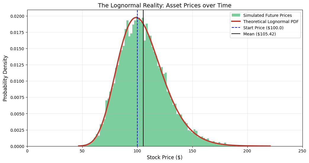
Figure 4
Key Takeaway: Mean > Median
The script calculates and plots both the Mean and the Median.
- Median: This is where the peak of the curve is. It represents the “most likely” outcome for the typical investor.
- Mean: The Mean is higher than the Median.
Why? The massive outliers in the “Long Tail” (the “to the moon” scenarios) pull the average up. This is a critical lesson for risk management: The “Average” return is often an overestimation of what a typical investor will actually experience, because the average is skewed by the lucky few.
Complete Code
import numpy as np
import matplotlib.pyplot as plt
import scipy.stats as stats
# ==========================================
# Hands-On: The Lognormal Distribution
# Context: Modeling Future Stock Prices (Not Returns)
# ==========================================
def run_lognormal_simulation():
# 1. Setup Parameters
# ——————-
# S0: Initial Stock Price
# mu: Expected annual return (drift)
# sigma: Annual Volatility
S0 = 100.0
mu = 0.05 # 5% expected growth
sigma = 0.2 # 20% annual volatility
num_simulations = 10000
# 2. Generate Synthetic Prices
# ——————-
# According to theory, if returns are Normal, prices are Lognormal.
# We simulate the price at the end of 1 year (T=1).
# The formula for the underlying Normal variable parameters (M, S)
# derived from geometric Brownian motion is:
# M (location) = ln(S0) + (mu – 0.5 * sigma^2)
# S (scale) = sigma
normal_mean = np.log(S0) + (mu – 0.5 * sigma**2)
normal_std = sigma
# Generate 10,000 random end-of-year prices
# We use the lognormal generator directly
future_prices = np.random.lognormal(mean=normal_mean,
sigma=normal_std,
size=num_simulations)
# 3. Visualization
# ——————-
plt.figure(figsize=(12, 6))
# Plot the Histogram (Empirical Data)
# Notice we use more bins to capture the long tail
count, bins, ignored = plt.hist(future_prices,
bins=100,
density=True,
alpha=0.6,
color=‘#27ae60’, # Green for Money/Price
label=‘Simulated Future Prices’)
# Plot the Theoretical PDF
# The x-axis represents Price ($), which must be > 0
x = np.linspace(min(future_prices), max(future_prices), 1000)
pdf = stats.lognormal.pdf(x, s=normal_std, scale=np.exp(normal_mean))
plt.plot(x, pdf, linewidth=3, color=‘#c0392b’, label=‘Theoretical Lognormal PDF’)
# 4. Critical Analysis: Skewness and Bounds
# ——————-
# Mark the initial price
plt.axvline(S0, color=‘blue’, linestyle=‘–‘, label=f‘Start Price (${S0})’)
# Calculate Mean and Median to show Skewness
sim_mean = np.mean(future_prices)
sim_median = np.median(future_prices)
plt.axvline(sim_mean, color=‘black’, linestyle=‘-‘, label=f‘Mean (${sim_mean:.2f})’)
plt.title(‘The Lognormal Reality: Asset Prices over Time’, fontsize=14)
plt.xlabel(‘Stock Price ($)’, fontsize=12)
plt.ylabel(‘Probability Density’, fontsize=12)
plt.legend()
plt.grid(True, alpha=0.3)
# Set x-axis limit to focus on the bulk of data, cutting off extreme outliers for readability
# (Though the tail theoretically goes to infinity)
plt.xlim(0, S0 * 2.5)
print(f“— Simulation Stats —“)
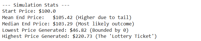
print(f“Start Price: ${S0}”)
print(f“Mean End Price: ${sim_mean:.2f} (Higher due to tail)”)
print(f“Median End Price: ${sim_median:.2f} (Most likely outcome)”)
print(f“Lowest Price Generated: ${min(future_prices):.2f} (Bounded by 0)”)
print(f“Highest Price Generated: ${max(future_prices):.2f} (The ‘Lottery Ticket’)”)
plt.show()
if __name__ == “__main__”:
run_lognormal_simulation()
2.3 The Inverse Normal (Inverse Gaussian) Distribution
The name is a potential source of confusion; it is not the “inverse” of the Normal distribution in an algebraic sense (like 1/x). Rather, it describes an “inverse” relationship between distance and time in the context of Brownian motion.
2.3.1 Mathematical Architecture
The Inverse Normal is bounded below by 0 (x ≥0) and is defined by:
- Location (a > 0): The mean of the distribution.
- Scale (b > 0): A shape parameter related to the drift and volatility.
The PDF is a complex exponential form involving the reciprocal of x:
Px=b2πx3exp-bx-a22a2x
- Mean: a
- Variance: a3/b
2.3.2 The First Passage of the Drunkard
To understand the Inverse Normal, one must imagine a drunkard wandering down a path (Brownian motion). The Normal distribution asks: “After time t, where is the drunkard?” The Inverse Normal asks the reverse question: “How long will it take for the drunkard to reach a specific distance d?”.
This is known as the First Passage Time distribution. In finance, it is a critical tool for barrier options and credit risk.
- Barrier Options: An option might be “knocked out” (become worthless) if the asset price touches a certain barrier. The probability of this happening before expiration is modeled using the Inverse Normal distribution.
- Default Risk: Structural credit models (like the Merton model) view a company’s default as the moment its asset value hits a barrier (its debt level). The time until default is therefore modeled as a First Passage Time.
The Inverse Normal captures the precariousness of leverage. It quantifies the waiting time until the inevitable collision with a boundary, whether that boundary is a margin call or bankruptcy.
2.3.3 Hands-On
The Scenario
In the Normal and Lognormal modules, we fixed the Time (e.g., “after 1 year”) and asked about the Price.
Now, we flip the question. We fix the Price (a Barrier) and ask about the Time.
The Question: “How long will it take for a stock with a positive trend to hit a specific price target?” or “How long until a company’s assets drop to the default barrier?”
This is known as the First Passage Time. The distribution of these “waiting times” is not Normal, it is Inverse Normal (also known as Inverse Gaussian).
The Code Explained
Step A: Simulating the Paths
We simulate 5,000 paths using a standard arithmetic Brownian motion with drift:
dXt=μdt+σdWt
In Python, we verify this by accumulating random steps:
steps = (drift * dt) + (volatility * np.sqrt(dt) * random_shocks)
paths = np.cumsum(steps, axis=1)
Step B: Detecting the Collision
The core logic lies in finding when the path crosses the line.
first_crossing_indices = np.argmax(paths >= barrier_level, axis=1)
np.argmax on a boolean array gives us the index of the first True value. This represents the exact moment the “drunkard” stumbled across the finish line.
Step C: The Shape of the Curve
When you view the plot, notice the shape:
- Starts at 0: It is impossible to hit a distant barrier in 0 time.
- Sharp Peak: Most paths hit the barrier around the “expected” time (Distance/Speed).
- Heavy Right Tail: Some paths “get lost.” The drunkard wanders in the wrong direction for a long time before finally correcting course and hitting the barrier much later. This creates a long “tail” of waiting times.
Figure 5
Financial Application: Barrier Options
In finance, this distribution is used to price Barrier Options (e.g., a “Knock-Out” call). If the stock hits a certain level, the option dies. The probability of the option dying before expiration is calculated by integrating this Inverse Normal PDF up to the expiration date.
Complete Code
import numpy as np
import matplotlib.pyplot as plt
# ==========================================
# Hands-On: The Inverse Normal Distribution
# Context: “First Passage Time” (Barrier Options / Default Risk)
# ==========================================
def run_inverse_normal_simulation():
# 1. Setup Parameters (The Drunkard’s Path)
# ——————-
# We model a random walk with a positive drift.
# Imagine a stock price or a firm’s asset value trying to reach a level.
num_simulations = 5000 # Number of “drunkards”
barrier_level = 2.0 # The distance they need to travel (d)
drift = 1.0 # Average speed (v)
volatility = 1.0 # How much they stagger (sigma)
# Simulation settings
dt = 0.001 # Time step size (very small for accuracy)
max_time = 15.0 # Max time to wait for them to cross
num_steps = int(max_time / dt)
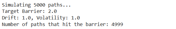
print(f“Simulating {num_simulations} paths…”)
print(f“Target Barrier: {barrier_level}”)
print(f“Drift: {drift}, Volatility: {volatility}”)
# 2. Vectorized Brownian Motion Simulation
# ——————-
# We generate all random steps at once for speed.
# dX = drift*dt + volatility*sqrt(dt)*Z
# Generate random shocks (Z)
random_shocks = np.random.normal(0, 1, (num_simulations, num_steps))
# Calculate step increments
steps = (drift * dt) + (volatility * np.sqrt(dt) * random_shocks)
# Calculate cumulative positions (paths)
# axis=1 means we sum across time for each simulation
paths = np.cumsum(steps, axis=1)
# 3. Find “First Passage Time”
# ——————-
# We need to find the *first* index where the path crosses the barrier.
crossing_times = []
# Create a boolean mask of where paths are above barrier
crossings = paths >= barrier_level
# argmax returns the index of the first True value
# If no True value exists (never crosses), it returns 0
first_crossing_indices = np.argmax(crossings, axis=1)
for i in range(num_simulations):
idx = first_crossing_indices[i]
# Check if it actually crossed (idx > 0) or if it crossed at the very start (unlikely)
# Also ensure the value at idx is actually >= barrier (handles “never crossed” case)
if crossings[i, idx]:
time_taken = idx * dt
crossing_times.append(time_taken)
crossing_times = np.array(crossing_times)
print(f“Number of paths that hit the barrier: {len(crossing_times)}”)
# 4. Visualization
# ——————-
plt.figure(figsize=(12, 7))
# A. Plot histogram of Hitting Times
count, bins, ignored = plt.hist(crossing_times,
bins=80,
density=True,
alpha=0.6,
color=‘#8e44ad’, # Purple for “Royal/Complex”
label=‘Simulated Hitting Times’)
# B. Plot Theoretical Inverse Gaussian PDF
# The formula for First Passage Time density is specific:
# f(t) = (d / sqrt(2*pi*sigma^2*t^3)) * exp( -(d – v*t)^2 / (2*sigma^2*t) )
t_values = np.linspace(min(bins), max(bins), 1000)
# Calculate PDF manually to ensure it matches the physical parameters
# (Scipy’s invgauss parameterization can be tricky to map to drift/diffusion)
numerator = barrier_level
denominator = np.sqrt(2 * np.pi * (volatility**2) * (t_values**3))
exponent_term = -((barrier_level – drift * t_values)**2) / (2 * (volatility**2) * t_values)
pdf = (numerator / denominator) * np.exp(exponent_term)
plt.plot(t_values, pdf, linewidth=3, color=‘#f1c40f’, label=‘Theoretical Inverse Normal PDF’)
# Add labels
plt.title(f‘The Inverse Normal: Time to Reach Barrier {barrier_level}’, fontsize=14)
plt.xlabel(‘Time Needed (t)’, fontsize=12)
plt.ylabel(‘Probability Density’, fontsize=12)
plt.legend()
plt.grid(True, alpha=0.3)
# Add an inset or secondary calculation for Mean Time
mean_theoretical = barrier_level / drift
plt.axvline(mean_theoretical, color=‘black’, linestyle=‘–‘, label=f‘Expected Time ({mean_theoretical:.2f})’)
plt.legend()
plt.show()
if __name__ == “__main__”:
run_inverse_normal_simulation()