
In our previous article, we laid the groundwork for financial analysis by exploring returns and the fundamental measures of risk. We now have the tools to quantify an asset’s performance and its volatility. However, to build robust investment strategies and truly understand a portfolio’s behavior, we need to dive deeper into the statistical relationships between assets.
In this guide, we will explore advanced risk-adjusted performance metrics and then critically examine the statistical distributions that govern financial data, leading us to a more realistic model for market returns.
Advanced Risk-Adjusted Performance
How Assets Dance Together: Covariance and Correlation
Understanding the risk of a single asset is useful, but portfolios are made of multiple assets. To understand portfolio risk, we need to know how those assets move in relation to each other. Combining assets with low or negative correlation is the cornerstone of diversification, allowing a portfolio to remain resilient even when one component is performing poorly.
- Covariance is a measure of the directional relationship between the returns of two assets. A positive covariance means the assets tend to move in the same direction, while a negative covariance means they tend to move in opposite directions. While it tells us the direction, its magnitude is not standardized, making it hard to interpret directly.
- Correlation takes covariance and standardizes it, giving us a much more interpretable number between -1 and +1.
- +1: Perfect positive correlation. The assets move in perfect lockstep.
- -1: Perfect negative correlation. The assets move in perfect opposition.
- 0: No correlation. There is no linear relationship between the assets’ movements.
Let’s look at the correlation between two major US stock indices, the S&P 500 and the NASDAQ, and the cryptocurrency Bitcoin.
import yfinance as yfin
import numpy as np
import pandas as pd
import datetime

# Assume 'df' is a DataFrame of log returns for SP500, NASDAQ, and Bitcoin
# For example:
start = datetime.date(2016, 11, 16)
end = datetime.date(2021, 11, 19)
df = yfin.download(["^GSPC", "^IXIC", "BTC-USD"], start, end)["Close"]
df = df.rename(columns={"^GSPC": "SP500"})
df = np.log(df) - np.log(df.shift(1))
df = df.dropna()

# Calculate the covariance matrix
covariance_matrix = df.cov()
print("Covariance Matrix:")
print(covariance_matrix)

# Calculate the correlation matrix
correlation_matrix = df.corr()
print("\nCorrelation Matrix (rounded):")
print(round(correlation_matrix, 3))
This produces the following correlation matrix:
| Ticker | SP500 | NASDAQ | Bitcoin |
| SP500 | 1.000 | 0.946 | 0.221 |
| NASDAQ | 0.946 | 1.000 | 0.228 |
| Bitcoin | 0.221 | 0.228 | 1.000 |
As you can see, the S&P 500 and NASDAQ are very highly correlated (0.946), which makes sense as they are both broad-based US stock indices with many overlapping companies. Bitcoin, however, has a very low positive correlation with the stock indices. This low correlation is a key reason why some investors add assets like Bitcoin to their portfolios. It provides diversification, as its price movements are largely independent of the stock market.
The Holy Grail: Measuring Risk-Adjusted Return with the Sharpe Ratio
So, we know how to measure return and how to measure risk. How can we combine them into a single, powerful metric? The Sharpe Ratio, developed by Nobel laureate William F. Sharpe, is a widely used measure that does just that, telling us how much excess return an investment generated for the amount of risk taken.
Formula:

Where:

A higher Sharpe Ratio is better, with a value over 1.0 generally considered good. Let’s calculate the daily Sharpe Ratios for the S&P 500 and Bitcoin.
# Calculate average daily return
mean_daily_return = df.mean()

# Calculate daily standard deviation
daily_std_dev = df.std()

# Calculate Sharpe Ratio (assuming risk-free rate is 0)
sharpe_ratio = mean_daily_return / daily_std_dev
print(sharpe_ratio)

This is a fascinating result. Even though Bitcoin was nearly five times more volatile than the S&P 500 during this period, its average daily return was so much greater that it delivered a superior risk-adjusted return.
A Smarter Risk Metric: Semi-variance (Downside Risk)
A key flaw in both standard deviation and the Sharpe Ratio is that they treat all volatility, both upside and downside, as equal. But investors have an asymmetric view of risk: upside volatility is welcomed, while downside volatility is feared. Semi-variance is a clever risk measure that only considers returns that fall below the average, giving a much better picture of an asset’s downside risk and potential for actual losses.
# Calculate the mean return for S&P 500
sp500_mean = df['SP500'].mean()

# Filter for returns below the mean
negative_returns = df[df['SP500'] < sp500_mean]

# Calculate semivariance
sp500_semivariance = ((negative_returns['SP500'] - sp500_mean)**2).mean()
print(f"S&P 500 Semivariance: {sp500_semivariance}")
Output: S&P 500 Semi-variance: 0.00014632175566078442
Are Stock Returns “Normal”?
All of the tools we’ve discussed so far rely on a big assumption: that returns are distributed in a predictable, “normal” way. In this section, we will challenge this fundamental assumption.
The Bell Curve Myth: What is “Normal”?
The normal or Gaussian distribution (the “bell curve”) is elegant and symmetrical. Its key properties are:
- Symmetry: The data is perfectly symmetrical around the mean.
- Central Tendency: The mean, median, and mode are all the same.
- The 68-95-99.7 Rule: This rule states that ~99.7% of all data points should fall within three standard deviations of the mean, implying that extreme events are exceptionally rare. (~95% within 2, and 68% within 1 standard deviation.)
A simple histogram of 20 years of S&P 500 daily returns looks roughly bell-shaped, but formal statistical tests tell a different story.
from scipy import stats

# D'Agostino and Pearson's test for normality
normality_test = stats.normaltest((np.array(df.SP500)))
print(f"Normality Test P-value: {normality_test.pvalue}")

# Jarque-Bera test for normality
jb_test = stats.jarque_bera((np.array(df.SP500)))
print(f"Jarque-Bera Test P-value: {jb_test.pvalue}")
Output:
Normality Test P-value: 3.085829035537216e-55
Jarque-Bera Test P-value: 0.0
The p-value we get is practically zero. The verdict: Daily stock returns are not normally distributed.
Where the Myth Breaks Down: The “Fat Tails”
The reason for this failure is the phenomenon of leptokurtosis, or “fat tails.” This means that extreme events, both positive and negative, happen far more often than a normal distribution would predict.
# Calculate mean and standard deviation
mean_return = df.SP500.mean()
std_dev = df.SP500.std()

# Calculate how many standard deviations away the min/max returns are
min_z_score = (df.SP500.min() - mean_return) / std_dev
max_z_score = (df.SP500.max() - mean_return) / std_dev

print(f"Minimum return is {min_z_score:.1f} standard deviations from the mean.")
print(f"Maximum return is {max_z_score:.1f} standard deviations from the mean.")
Output:
Minimum return is -8.8 standard deviations from the mean.
Maximum return is 7.8 standard deviations from the mean.
The data shows events that are ~8 standard deviations away from the mean; events a normal distribution would deem impossible. Relying on a model that ignores these “fat tails” is dangerous.
A Better Fit: The Student’s T-Distribution
If the normal distribution is the wrong tool, what’s the right one? Enter the Student’s t-distribution. It’s also symmetrical and bell-shaped, but its tails are “heavier” or “fatter.” It assigns a higher probability to extreme outcomes. Its flexibility comes from a parameter called degrees of freedom (df), which controls the thickness of the tails.
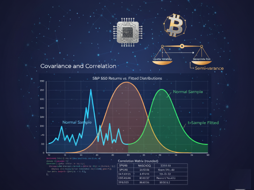
Let’s fit both a Normal and a Student’s t-distribution to our S&P 500 data and plot them for comparison.
import matplotlib.pyplot as plt

# 1. Generate a sample from a Normal distribution with the same mean/std
np.random.seed(222)
df["Normal Sample"] = stats.norm.rvs(
    size=len(df),
    loc=df.SP500.mean(),
    scale=df.SP500.std()
)

# 2. Fit a Student's t-distribution to the data using MLE
params = stats.t.fit(df.SP500)

# 3. Generate a sample from the fitted t-distribution
df["t-Sample Fitted"] = stats.t.rvs(*params, size=len(df))

# 4. Plot the Kernel Density Estimates (KDEs) for comparison
df[["SP500", "Normal Sample", "t-Sample Fitted"]].plot(
    kind="kde",
    figsize=(12, 5),
    xlim=(-0.1, 0.1),
    title="S&P 500 Returns vs. Fitted Distributions"
)
plt.show()

The plot clearly shows the t-distribution (green) is a remarkably better fit for the actual data (blue) than the normal distribution (orange), especially in capturing the central peak and the fat tails.
Conclusion: Beyond the Bell Curve
Our journey has shown that while simple models like the normal distribution are convenient, they can be misleading. The Student’s t-distribution offers a significant step up in accuracy, providing a more robust framework for risk management, portfolio simulation, and option pricing. By understanding the limitations of our assumptions and constantly seeking better tools, we become more informed analysts, better equipped to navigate the challenging and rewarding landscape of the financial markets.