

Welcome to the fascinating world of financial data analysis. At the heart of every investment decision, from a speculative cryptocurrency purchase to a conservative government bond, lie two fundamental questions: “What is my potential return?” and “What is the risk involved?” Return is the ultimate measure of performance, but it’s only half of the story. The other, equally important half, is risk. An investment is a journey, and while the return tells you how high you’ve climbed, the risk describes the uncertainty of the path.
In this guide, we’ll embark on a practical journey to understand both sides of the investment equation. We will start with the basics of analyzing prices and calculating returns, and then build on that foundation to measure and interpret financial risk using various volatility metrics.
Analyzing Prices and Calculating Returns
Why Price Isn’t the Whole Picture
It’s tempting to look at the price of a stock and judge its value. A stock priced at $500 seems more “expensive” than one at $50. However, this is a common and often costly misconception. Price is simply a snapshot in time; it tells you the cost of entry, but very little about an investment’s potential or past performance. A $50 stock that doubles in value to $100 has provided a far better return (100%) than a $500 stock that inches up to $550 (10%).
To make meaningful comparisons, we need a scale-free measure. This is where returns come in. Returns tell you the percentage gain or loss, allowing for a true apples-to-apples comparison between assets of wildly different prices.
Let’s start by pulling some data into Python. We’ll look at two very different stocks, Amazon (AMZN) and Ford (F), along with Bitcoin (BTC-USD), over a five-year period.
import datetime
import matplotlib.pyplot as plt
import numpy as np
import yfinance as yfin

# Define the date range for the last 5 years
start = datetime.date(2016, 11, 16)
end = datetime.date(2021, 11, 19)
df = yfin.download(["AMZN", "F", "BTC-USD"], start, end)["Close"]

# Take a look at the first few rows
print(df.head(10))
Output:
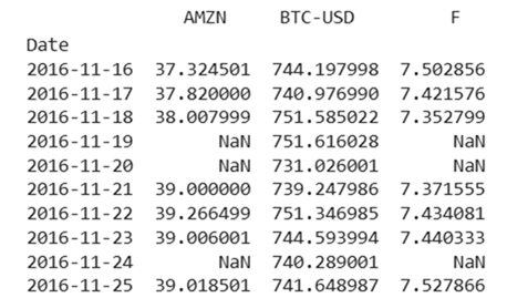
A quick look at the data reveals an important characteristic: we have NaN (Not a Number) values for the stocks on weekends. This is because equities only trade Monday through Friday, while cryptocurrencies trade 24/7. This is a common issue that needs to be handled in data analysis.
We can also get a quick statistical summary of the prices.
# Get summary statistics of the price data
print(df.describe())
Output:
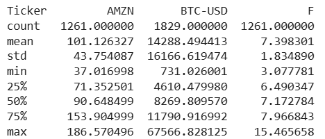
While this tells us the mean, standard deviation, and range of prices, it’s difficult to compare these assets directly because their price scales are so different. A chart illustrates this perfectly.
# Create a figure with a shared index but different y-axis scales
fig = plt.figure(figsize=(12, 6))
ax1 = fig.add_subplot(111)
ax2 = ax1.twinx()
ax3 = ax1.twinx()

# Plot the 2020 price data for each asset
df["2020-01-01":"2020-12-31"].plot(ax=ax1, y="AMZN", legend=True)
df["2020-01-01":"2020-12-31"].plot(ax=ax2, y="BTC-USD", legend=True, color="g")
df["2020-01-01":"2020-12-31"].plot(ax=ax3, y="F", legend=True, color="r")

# Set the labels for the axes
ax1.set_ylabel("AMZN")
ax2.set_ylabel("BTC-USD")
ax3.set_ylabel("F")
ax3.spines["right"].set_position(("outward", 60))
plt.title("Price Comparison in 2020")
plt.show()
Output:
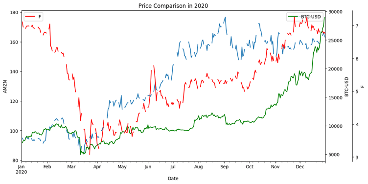
The chart clearly shows why using price alone isn’t ideal. The scale of Bitcoin’s price dwarfs that of Ford, making a visual comparison of their performance nearly impossible.
Calculating Return on Investment
To truly compare these assets, let’s calculate the return on a hypothetical $1,000 investment in each. On our start date of November 21, 2016 (the first weekday in our dataset), the prices were:
- AMZN: $780.00
- F: $8.38
- Bitcoin: $739.25
With $1,000, we could have purchased:
- AMZN: 1.282 shares
- F: 119.403 shares
- Bitcoin: 1.353 units
By our end date of November 18, 2021, the prices had grown significantly. Multiplying our shares by the final prices gives us the future value of our investment:
- AMZN: 1.282 * $3,696.06 = $4,738.35
- F: 119.403 * $17.14 = $2,046.57
- Bitcoin: 1.353 * $56,942.14 = $77,042.72
All three were profitable, but the difference is staggering. Bitcoin was the clear standout. To standardize this, we use the simple return formula:
Simple Return Formula:
R_simple = (P_final − P_initial) / P_initial
This yields the following returns:
- AMZN: 373.84%
- F: 104.66%
- Bitcoin: 7,604.27%
This dramatic difference highlights the concept of the risk-reward tradeoff. Bitcoin, a relatively new and volatile asset, offered an astronomical potential for reward. The more established stocks, while still providing excellent returns, were far less explosive.
Adding Bonds to the Mix
Let’s introduce a fourth asset class: bonds. We’ll use an ETF, the Vanguard Long-Term Bond Index Fund (BLV), as a proxy. Bonds are generally considered safer than stocks. A $1,000 investment in BLV over the same five-year period would have grown to approximately $1,418.11, a return of 41.81%.
This is a much lower return, which is expected. Bondholders have less credit risk than stockholders and receive regular coupon payments. This makes them a lower-risk, and consequently, lower-reward asset class.
Part 2: Measuring Risk and Volatility
Return is only one side of the investment equation. The other is risk, which we can quantify by measuring volatility. Let’s compare two stock indices: the S&P 500 (large-cap stocks) and the Russell 2000 (small-cap stocks).
# Pull 10 years of daily price data
start_indices = datetime.date(2015, 11, 25)
end_indices = datetime.date.today()

prices_indices = yfin.download(["^GSPC", "^RUT"], start_indices, end_indices)["Close"]
prices_indices = prices_indices.rename(columns={"^GSPC": "SP500", "^RUT": "Russell2000"})

print(prices_indices.head())
Output:

Price Volatility: High-Low Range
A simple way to get a feel for volatility is to look at the difference between the highest and lowest prices over a period.
Output:
# Calculate the high-low range for the last year of data
currYear = prices_indices.loc[datetime.date.today() - datetime.timedelta(365) : datetime.date.today()]
high_low_range = currYear.max() - currYear.min()
print(high_low_range)

# Standardize by dividing by the current price
standardized_high_low = high_low_range / prices_indices.iloc[-1]
print(standardized_high_low)

This metric shows the Russell 2000 to be more volatile, which is in line with expectations for smaller companies.
Moving Averages: Smoothing the Noise
A moving average smooths out price data to create a single flowing line, making it easier to identify the underlying trend. The 50-day and 200-day moving averages are common technical indicators.
Output:
# Calculate and plot the 50-day moving average for the S&P 500
prices_indices["SP500_50_day_rolling_avg"] = prices_indices.SP500.rolling(50).mean()

plt.figure(figsize=(12, 5))
plt.plot(prices_indices["SP500"], label="Daily S&P 500 Prices")
plt.plot(prices_indices["SP500_50_day_rolling_avg"], label="50-Day Rolling Avg")
plt.legend()
plt.show()
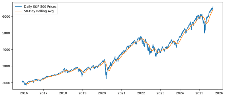
We can use this to create another volatility metric: the average absolute distance between the daily price and the moving average, standardized by the price.
# Moving average volatility
ma_volatility = ((abs(prices_indices - prices_indices.rolling(50).mean())) / prices_indices).mean()
print(ma_volatility)
Output:
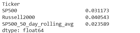
Again, this confirms that the Russell 2000 has been more volatile.
Standard Deviation: The Analyst’s Choice
While the above metrics are useful, the most popular measure of volatility is standard deviation. It’s crucial to calculate this on returns, not prices, for a fair comparison. Let’s calculate the log returns for our two indices.
# Calculate log returns
log_returns_indices = np.log(prices_indices) - np.log(prices_indices.shift(1))
log_returns_indices = log_returns_indices.dropna()

# Calculate the standard deviation of daily returns
std_dev_returns = log_returns_indices.std()
print(std_dev_returns)
Output:
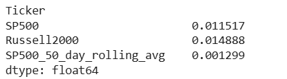
The standard deviation of daily returns once again confirms that the Russell 2000 is the more volatile of the two indices.
Putting It All Together: A Comparison Function
To make our analysis reproducible, we can wrap these metrics into a single Python function.
import pandas as pd
import datetime
import matplotlib.pyplot as plt
import numpy as np
import yfinance as yfin

def investCompare(startTime, endTime, tickers):
    # Pull price data
    prices = yfin.download(list(tickers.keys()), startTime, endTime)["Close"]
    prices = prices.rename(columns=tickers)

    # Calculate log returns
    returns = np.log(prices) - np.log(prices.shift(1))
    returns = returns.iloc[1:, 0:]

    # Calculate High-Low volatility for the last year
    currYear = prices.loc[datetime.date.today() - datetime.timedelta(365) : datetime.date.today()]
    highLow = (currYear.max() - currYear.min()) / prices.iloc[-1]
    highLow = pd.DataFrame(highLow, columns=["HighMinusLow"])

    # Moving average volatility
    MA = pd.DataFrame(
        ((abs(prices - prices.rolling(50).mean())) / prices).mean(),
        columns=["MovingAverageVolatility"],
    )

    # Combine metrics into a single DataFrame
    investments = pd.merge(highLow, MA, left_index=True, right_index=True)
    investments = pd.merge(
        investments,
        pd.DataFrame(returns.std(), columns=["StandardDeviation"]),
        left_index=True,
        right_index=True,
    )
    investments = pd.merge(
        investments,
        pd.DataFrame(100 * returns.mean(), columns=["Daily Return Percentage"]),
        left_index=True,
        right_index=True,
    )

    return investments.round(3)

# Example usage: Growth vs. Value ETFs
print(investCompare(
    datetime.date(2010, 1, 1), datetime.date.today(), {"VUG": "Growth", "VTV": "Value"}
))
Conclusion: The Journey Continues
This lesson has served as a foundational starting point. We’ve moved from simple price analysis to calculating returns and quantifying risk with various volatility metrics. We’ve seen that different asset classes carry different levels of risk and potential reward. Even within a single asset class like stocks, there are variations between growth, value, and company size.
In the next lesson, we will build upon these concepts, introducing more advanced risk-adjusted return metrics and exploring the statistical distributions that govern financial data.
